It is intriguing how information can be communicated in so many different ways. On a daily basis I see how cultural understanding or cultural misunderstanding plays a role in information delivery.
Information can be delivered with simple building blocks such as colour. But beyond face-value, when transmitting information supported by colour we need to understand the psychology of colour. Different cultures have different associations for colour. For example, in Western cultures, black is traditionally used for mourning whereas in Chinese culture, white is the colour for mourning. Westerners understand black and white as opposites while the Chinese traditionally understand white and red as colour opposites.

Iconography and symbols become even more complex when translating visual information for different cultures. An ‘Offering Hand’ pictogram could represent ‘help’, ‘service’ and ‘support’ in one culture whereas in other cultures the ‘Offering Hand’ is a symbol for saving water and being environmentally conscious. But this is only scratching the surface when you consider the disastrous consequences of misunderstanding the intention of a symbol.
Beautiful Information
Designers deal with Information Design on a daily basis, sometimes it is subtle such as a fashion designer choosing a soothing colour of a textile or an industrial designer forming a ‘less aggressive’ edge on a product. In this digital age, many designers are creating and moulding information to transmit knowledge and infographics are a popular format to convert statistical data into formats which are easy to understand and are more engaging.
The next level of Information Design is interactive real-time data visualisation.
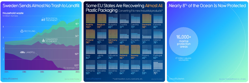
David McCandless is founder of “Information is Beautiful”. He is also a writer, designer, creative director, artist and entrepreneur with a team of creatives in London. On his website informationisbeautiful.net he collates ideas on how to present complex data in an understandable visual language. This is supported with their beautifulnews blogs which identifies new trends, uplifting stats and creative solutions. Well worth a look!

